ITV’s Rebrand: A masterclass in evolving with purpose.
2 minute read
There’s nothing louder than quiet confidence, and ITV’s new look is speaking volumes.

ITV’s new brand identity signals a clear step forward. It’s confident, adaptable, and rooted in purpose. And while it’s easy to get lost in the sparkly animation or the vibrant yellow, what really stands out is the strategy behind it.
Rather than chasing novelty, ITV’s refresh focuses on coherence. For years, the network developed a patchwork of sub-brands, each with its own quirks. The 2022 launch of ITVX introduced an energetic digital aesthetic, but the broader brand still felt fragmented. The rebrand resolves that by giving the masterbrand centre stage, and ensuring a consistent experience across broadcast, streaming, and digital channels.
For anyone considering a rebrand, this is a reminder that visual identity should grow from strategic clarity, and not from a desire to look different. When brands start with “why,” the design naturally becomes more purposeful.
At the core of the ITV’s new look is 'The Apex,' a flexible geometric tool derived from the ITVX 'X'. A static logo is often the hardest thing to integrate across dynamic digital spaces. The Apex solves this by being fundamentally adaptable: it's a kit of parts. It allows the brand to scale and shift its energy to match the content - from the high pace of live sport to the static backdrop of a news graphic - without losing its ITV connection. This is the definition of a brand asset that works for the entire ecosystem, rather than against it.
Seeing this, we’re reminded of the importance of creating adaptable brand systems. By designing elements that can move, expand, and shift across formats, a brand can feel alive without losing coherence. This is the kind of thinking we encourage during initial rebrand discussions with our clients, visual tools that work across all channels without fragmenting the brand.
Another significant move is ITV’s commitment to one hero colour, Spark Yellow. Colour choices are deceptively strategic. Retiring the competing sub-channel palettes dramatically reduces visual complexity. This focused use of a single, vibrant colour strengthens the brand's immediate emotional impact and improves design efficiency, ensuring instant recognition everywhere from a billboard to a tiny thumbnail.
So, what makes this rebrand work?
From a design perspective, several lessons stand out:
- Purposeful simplicity: ITV stripped back visual clutter to focus on what really matters - its core identity.
- Flexible design systems: The Apex allows the brand to adapt without losing consistency.
- Continuity: By nodding to the old ITVX geometry, the brand preserves memory while evolving for the future.
- Audience-first thinking: Every change considers how viewers interact with content, from social media feeds to broadcast.
ITV’s rebrand is a reminder that evolution is more than aesthetics. It’s about creating clarity, flexibility, and a sense of cohesion across every touchpoint. A successful refresh doesn’t shout. It guides, connects, and adapts.
For brands looking to take a similar approach, the takeaway is clear: start with the story your brand wants to tell, design flexible systems that can grow and move, and ensure every element from colour to motion is purposeful. And keep your brand strategy laser focused on your commercial objectives. With the right planning and execution, a brand refresh can feel seamless, strategic, and genuinely modern just like ITV’s.
Thinking of refreshing your own brand’s identity? Get in touch with us here.

Our Services.
- Brand Identity
- Visual Identity
- Brand Communication
Blog.
All blogs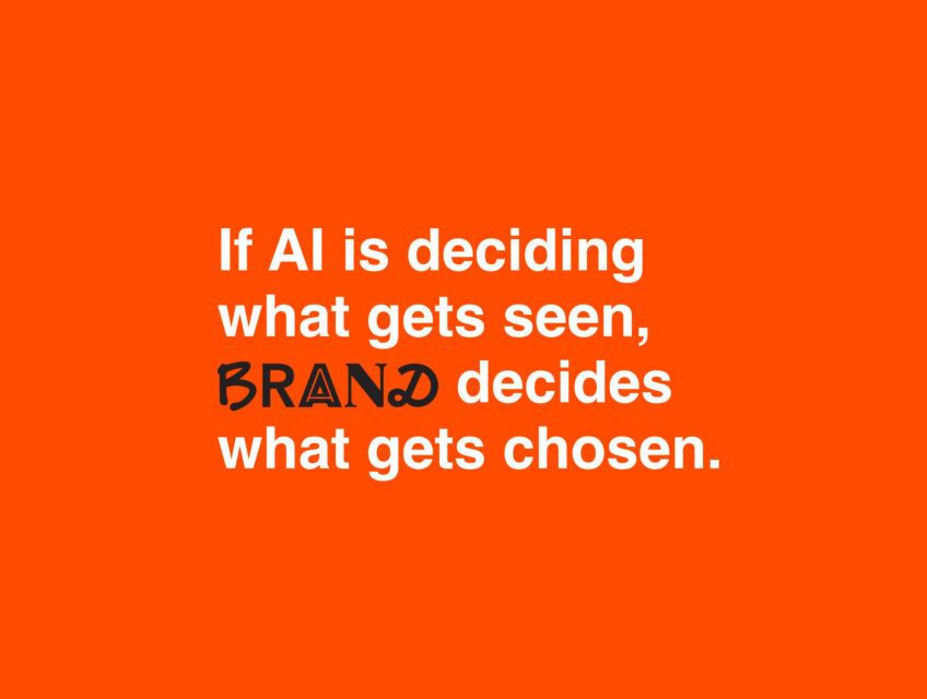
If AI is deciding what gets seen, brand decides what gets chosen.
The rules of online visibility are being rewritten - fast. But what does this mean for your business, and what can you do about it?