Picasso, the Tate, and lessons in simplicity.
1 minute read
Good design isn't about what you add, it's about what you have the courage to take away.
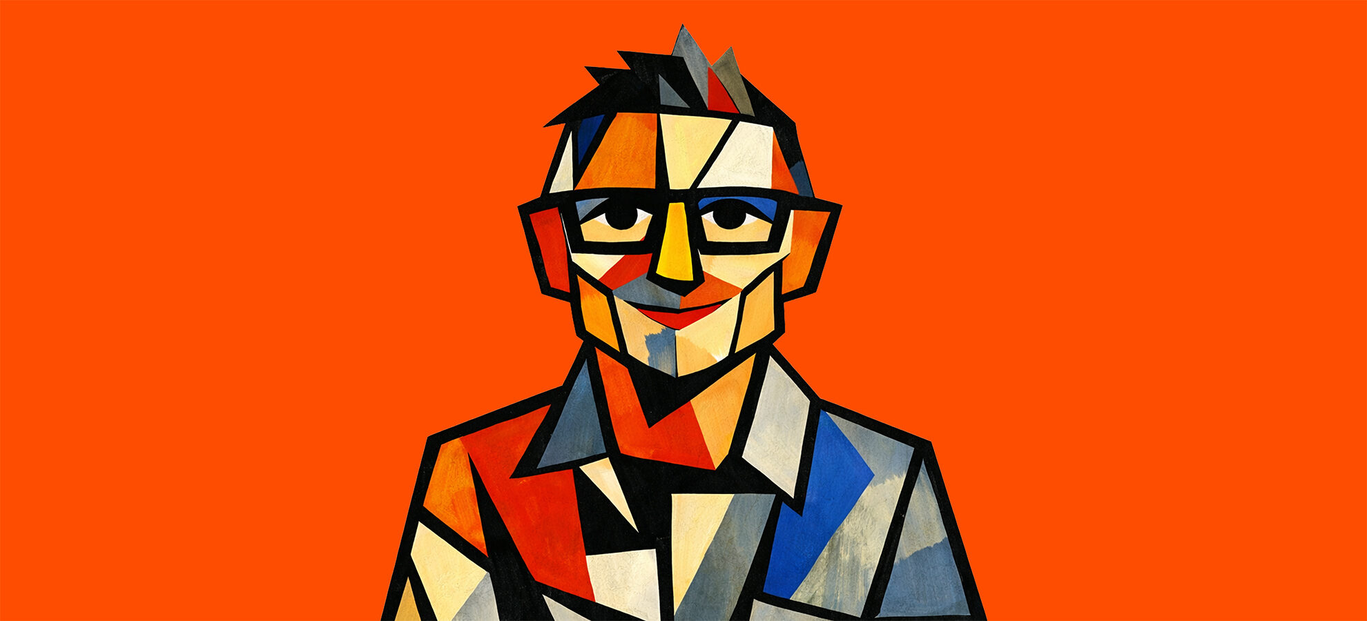
Last Saturday I found myself at the Tate Modern for Theatre Picasso.
Now, let me share a little secret with you - usually, a Creative Director in a gallery is a dangerous thing. We spend half the time critiquing the kerning on the placards and the other half wondering if the gift shop is selling a t-shirt in that specific shade of 'Existential Crisis Blue.'
This exhibition centres on the centenary of The Three Dancers (1925), a work that vibrates with the cubist, performative energy that defined Picasso’s life. Through the lens of theatre, we see how Picasso viewed the world - not as a static reality to be captured but as a stage where forms are constantly deconstructed, reassembled, and simplified to their emotional core.
Then as I moved onwards through the exhibition and from room to room, I realised Picasso wasn't just a painter. He was the ultimate master of communication.
Suddenly everything became clear.
Picasso takes something incredibly complex, a bull, a face, a theatrical stage and distils it until only the ‘honest truth' is left. That's why he famously said it took him four years to paint like Raphael, but a lifetime to paint like a child.
He was the master of the 'Simplicity Pivot'.
He understood that any amateur can add more but it takes a master to know what to take away.
That good design isn’t about filling space. It's about creating a shortcut to understanding.
That whether the construct is a brand identity, a user interface, or a piece of copy, its job is to succeed through simplicity and economy. To bypass the noise and deliver a message with zero friction. If you have to explain how to use it or what it means, the design has already failed.
As I neared the end, I was left reminded that the most effective communication doesn’t demand your effort - it rewards your attention by being direct.
Or, to put it another way, it’s about killing your darlings and stripping away the ego until there is nowhere left for the message to hide.
Because in a world shouting for attention, simplicity speaks volumes.
Thanks Pablo. Wise words amongst the clicks, swipes, overload and eyeballs we all contend with today.

Blog.
All blogs
Old solutions for modern problems.
How health and safety messages can be best communicated through lenticular print.
Email marketing for beginners: a step-by-step guide .
Email marketing remains one of the most powerful and cost-effective digital marketing channels available to businesses today.
Design That Builds Dialogue.
How strategic graphic design strengthens community engagement.